Into the Unknown
The stock market as measured by the S&P 500 ended the first quarter in positive territory as the tumult and chaos in Washington that marked the fourth quarter of 2020 gave way to fear and loathing as investors tried to figure out what will lie ahead for 2021 and beyond.
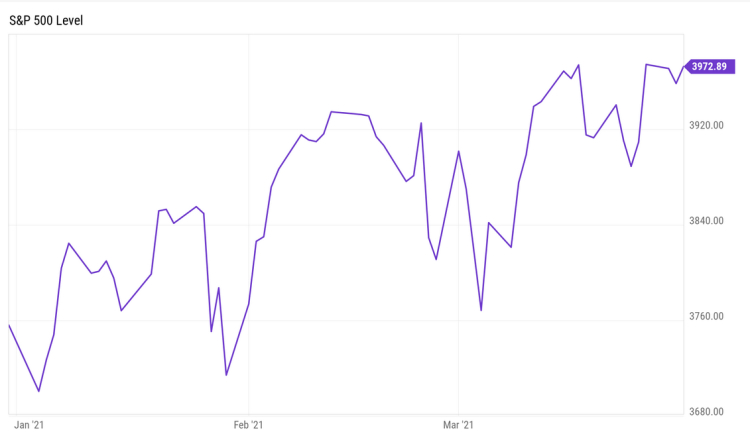
S&P 500 Price Chart Q1 2021
One thing that stood out was that the Nasdaq 100, while still ending up for the quarter, substantially underperformed the S&P, something that we have not seen very often. In fact, the move down in mid-February / early-March was enough to qualify as a technical retracement for those of us who still dabble in technical analysis.
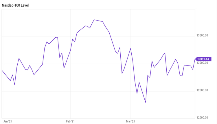
NASDAQ 100 Price Chart Q1 2021
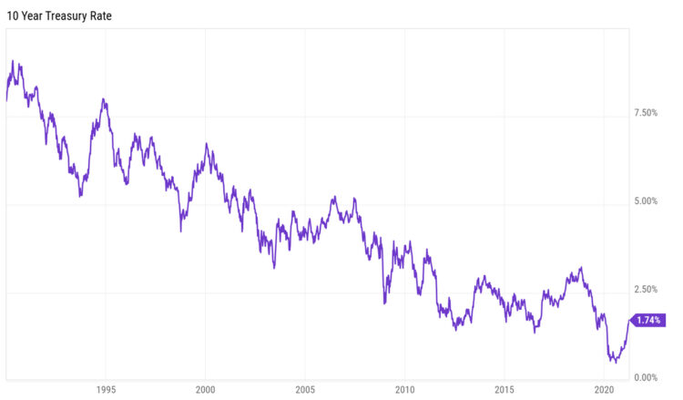
Much of the pullback was attributed to the 10-year Treasury yield which rose about 30 basis points in March (which makes the price of the bonds fall), as investors “reset expectations for how much they were willing to pay for pricey tech shares as higher rates and inflation concerns dominate the landscape,” according to market pundits.
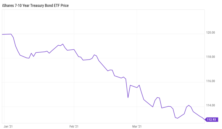
iShares 7-10 Year Treasury Bond ETF Price Chart Q1 2021
However, panning out back out to mid-year 2019, it looks like interest rates are merely approaching pre-COVID levels as vaccines continue to be rolled out and consequently markets sense a return to “normal” activity.
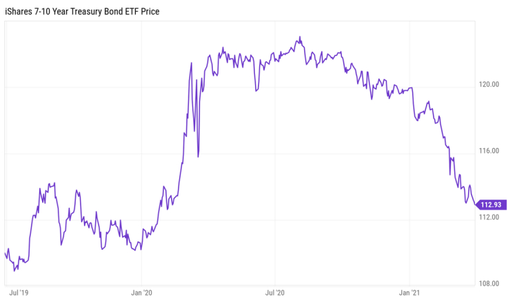
iShares 7-10 Year Treasury Bond ETF 6/30/20 – 3/31/21 Price Chart
It appears that the underperformance in both Treasuries and technology could be a bit of an overreaction and not the beginning of a large-scale downturn. If interest rates begin stabilizing as they approach the 2% levels, it could be enough to calm investor fears and keep the algo traders from whip-sawing the daily moves as we slowly creep towards a broader economic reopening.
Our main concern, as always, is less about what just happened than what will happen next. We have spent a lot of time reading and researching, looking at facts and collecting opinions. This has resulted in more sleepless nights than we have had in a very long time as we contemplate not only what lies ahead for us, but also our children and future generations.
So, buckle up as we try to unwrap all this in a way that is logical and understandable.
Conflicting Messages
Will the market continue to climb or are we at the beginning of a meltdown, economic boom or bust, inflation or disinflation?
We have read many articles from knowledgeable people that make good arguments for all of those scenarios. As investors, our job is to sift through all the information and arguments and position ourselves for the most likely scenario while having a plan B and plan C in place if we are either wrong or, like last year, something comes out of nowhere to completely change the environment.
One thing we always look for when researching such a diverse universe of opinions is whether they are concluded with a pitch. For instance, one writer that we have followed since the late 1990’s has been writing exclusively that the Bull market will end in 2021 and a meltdown will ensue. And while his arguments are valid, and warrant consideration, each piece ends with a pitch for a new service that will cost more money over and above the fee we are paying for his current content.
So, without a pitch at the end, we will try to take you down a logical path for what we think we should be doing with our money at this time.
Economic Boom or Bust?
The Federal Reserve voted in March to keep interest rates unchanged. They also gave an upbeat forecast of economic growth. In effect, they are saying that they are willing to let the economy run “hot” and risk higher inflation to capture the benefits of stronger growth.
The Paris-based Organization for Economic Cooperation and Development expects U.S. GDP to grow 6.5% in 2021—more than double its December forecast of 3.2%.
J.P. Morgan Global Research forecasts volatile but strong global growth as economies reopen. Heading into the new year, J.P. Morgan Global Research analysts believe recovery, reflation, and rotation against the backdrop of accommodative monetary and fiscal support will set the backdrop for key market and economic calls for 2021. “Global growth will be below trend in early 2021, but the strongest global recovery in a decade will play out by the end of 2021 if the vaccine prospects play out as expected,” said Joyce Chang, Chair of Global Research.
Goldman Sachs research expects the $1.9 trillion stimulus package should suffice for a small positive fiscal impulse to US growth in coming quarters.
However, the hard data is still painting a picture of low inflation, weak job creation, high savings and only modest GDP growth going forward, the opposite of what the everyone expects.
First, let’s look at GDP. In our opinion, this is one of the worst measures of economic health ever invented because of its dependence on spending as an indicator of real growth and, as a by-product, wealth creation, which should be the goal of participants in a free market economy.
As an example, both I and my neighbor across the street mow our own lawns (I find the walking to be therapeutic and I accomplish something while walking). Now, each time my neighbor and I cut our respective lawns; we add nothing to GDP.
However, if I convince my neighbor to cut my lawn for $10 and I in turn cut his for $10, which would be a better deal for me since my yard is quite hilly with a lot of trees to cut around, we will create $20 in GDP according to the economists. No wealth is created; we just exchanged two pieces of paper and yet, hurrah, GDP has grown!
Keep in mind that when we discuss growth, we are talking about the year-over-year change in the metric. GDP, whether good or bad, is a measure of output. So, when they predict record growth, they are talking about a change in output. So, the logical question is:
“Compared to what?”
For instance, if I tell you my 1-year-old Golden Retriever increased his weight 100% over the past year, that is a lot different than if he was already a fully grown 8-year-old dog. So, where we started from is just as important as how far we’ve gone. A puppy growing 100% is no big deal but a fully grown dog growing 100% is quite a big deal.
According to the Bureau of Economic Analysis, Real GDP for 2020 decreased 3.5 percent in 2020 (from the 2019 annual level to the 2020 annual level), compared with an increase of 2.2 percent in 2019.
So, if we establish 2019 GDP as a baseline, GDP growth of 6% only gets us to an average annual growth rate of approximately 2.3% or close to what we saw in 2019.
For reference, GDP Growth Rate in the United States averaged 3.17 percent from 1947 until 2020, and according to many economists, a rate of growth below 2% is not strong enough to absorb population growth.
Instead of GDP, we prefer to look at more pedestrian numbers to give us clues of real economic activity. And right now, those numbers do not look very promising.
Even with some recovery occurring from May to December, the December 2020 level of employment was still down by 8.9 million jobs compared to the pre-pandemic February 2020 level.
If we go to TracktheRecovery.org, which is a project of Harvard and Brown universities, the latest estimates (accessed on January 20) point to 29.7 percent of small businesses closing from January 2020 to the end of December 2020.
According to the SBA’s Office of Advocacy (based on Census Bureau data), there are (or were) 31.7 million small businesses in the United States. So, applying that percentage of closures to the universe of small businesses results in an estimated 9.4 million small businesses closed.
Now, that would be up from the depths hit in mid-April when 44 percent of small businesses were closed. Also, we do not know how many of these businesses are closed permanently.
But the bottom line still points to an estimated 9.4 million businesses being closed – some temporarily and some permanently.
And these are not just small restaurants and taverns, according to the website Crunchbase, 628 manufacturing companies ceased operations.
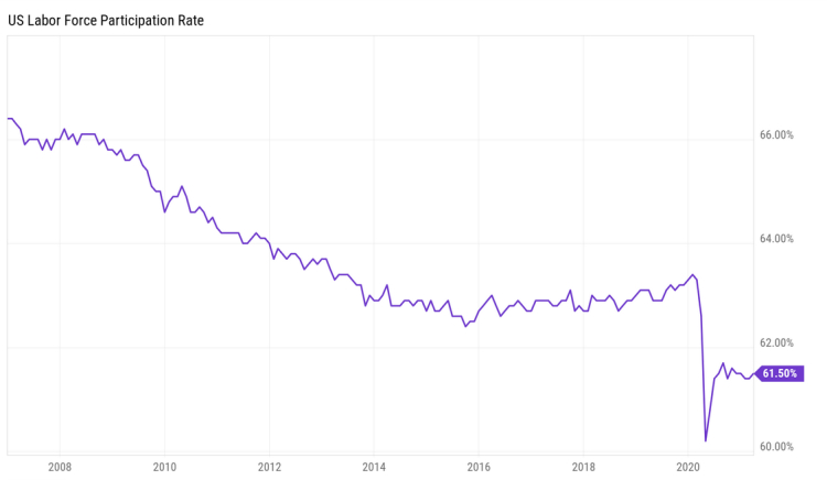
The labor force participation rate (LFPR) is the number of people seeking work or working, as a percentage of the total population. In February 2021, it was 61.4% according to the Bureau of Labor Statistics.
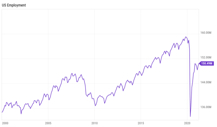
Next, we look at the Current Population Survey (CPS) from the Bureau of Census which is a household employment survey that includes both business hiring as well as self-employed, farmworkers, unpaid family workers, persons employed by private households and workers temporarily absent from work without pay.
Total employment peaked in December of 2019 at 158,735,000 people working. As of the latest available data, that number stands at just over 150 million. Those numbers pay no regard as to the possible change in wages from taking lower paying positions just to be able to pay the bills.
So, while we are getting closer, there are still fewer people employed today than in 2019.
 Here is another graph which shows how the current job recovery has been distributed:
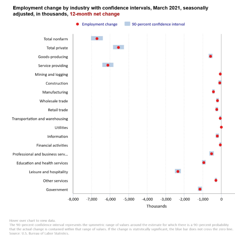
Taking all of this in consideration, the economy is in many ways, a lot worse off than it was after the Dotcom crash or Housing Bubble. The recovery to date has less resembled a V-shape and more of a <-shape, where people and industries that could adapt to work from home or were deemed essential, grew their wealth in 2020 while those in the other category lost dramatically.
Based on these numbers and other data we follow, we believe that real economic growth is slowing now and will worsen as the year progresses. That’s especially true as several states continue to suppress their economies with lockdown restrictions due to the COVID -19 virus and the new administration in Washington begins to implement policies of higher taxes and more regulations including stopping new oil and gas exploration that will result in job losses as well as higher energy prices.
Regarding taxes, only twice in history has an administration raised taxes following a financial crisis, the Roosevelt administration in 1933 and the Obama administration in 2009.
In both cases, this resulted in an extended economic depression which economist John Maynard Keynes defined as “a chronic condition of subnormal activity for a considerable period without any marked tendency towards recovery or towards complete collapse.”
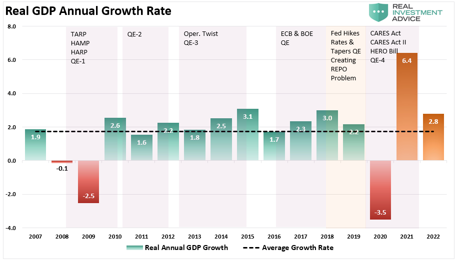
Unlike recession, depression is not negative growth, but it is below-trend growth. As mentioned above, historical growth is 3.17% including 2010 to 2020, so sustained periods of sub 3% as we have experienced over the last 10 years is a depression exactly as Keynes defined it. Looking at the graph below, we think we will see a spike similar to 2010 in the annual change (bottom graph), thanks to reopening and massive government stimulus, followed by a revision to where things had been trending (top graph).
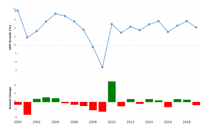
GDP Growth 2000 – 2020
And while the administration is promising additional spending a new, multi-trillion dollar package focusing on infrastructure, we note that a similar, albeit much smaller package was passed in 2010 also intended for “shovel-ready” infrastructure jobs. While it provided a short burst of “growth” in 2010 as shown above, the growth proved to be unsustainable similar to the make-work programs in the 1930’s.
What this means is, in the absence of real economic growth, the government will have to rely on monetary policy to continue to prop up the reported growth numbers. This would just be a continuation of what we have been experiencing this century as much of the growth in the U.S. since 2000 is due to a variety of artificial inputs from increasing federal expenditures:
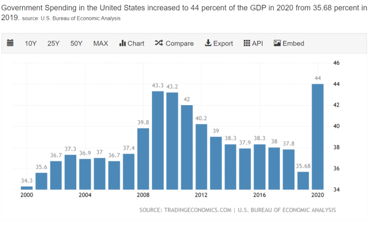
Note that the above chart does not include the military spending due to various interventions in the Middle East but does include several “bailouts” over the last decade which are a function of increasing debts and deficits or extraordinary monetary interventions. The chart below puts those various events on a timeline with the corresponding growth in real GDP.
As you can see, the Fed didn’t even try to unwind some of their programs until 2018 – 2019.
Based on where we are today and the current political climate, it would not surprise us if an absence of a real recovery in job and wage growth results in calls for a program of universal basic income, probably given a name like “Social Security for All.” or something similar. Programs like that are now being tried in the cities of Oakland and Stockton, California and are slated to be tried in as many as 11 cities around the country in 2021. This would of course result in even more government spending.
Now many would argue that an intervention-based economy is unsustainable due to the natural limits of increasing debt. You can count us in that camp, though Washington has been slowly coming around to accepting the ideas put forth by proponents of something called Modern Monetary Theory. Consequently, we need to understand what that theory is.
Modern Monetary Theory
We could write a book on MMT, but someone already has, her name is Stephanie Kelton. She was an economic advisor to Bernie Sanders’ presidential campaigns in 2016 and 2020. She also served as the Chief Economist to the Democrat Minority staff of the Senate Budget Committee from 2014 till 2016. The title of her New York Times bestselling book is The Deficit Myth (2020). If you want a deep dive into MMT, this book will do the trick although be warned that it is written by a proponent for using it as a basis for fiscal and monetary policy.
We will provide just an overview of the theory to give you context for everything that you are seeing and hearing coming out of Washington DC.
To start with the term “Modern” makes the theory sound like something shiny and new, however, according to an article by economist James Rickards, MMT has its roots in an economic theory called Chartalism that was advocated and expanded in the late 19th and early 20th century by an economist named Georg Friedrich Knapp. Chartalism relies heavily on European financial systems from the 19th century. So, there is nothing particularly modern about the concept.
According to MMT, money has value only because it is issued by the state and the state will only accept their money in the payment of taxes. Citizens “need” the state-issued money because they must pay their taxes. So, money is whatever the state says it is and has value because the state says it does.
Because the state controls the money, it can issue as much as it wants. So, when it comes to budgets, the state can run up an unlimited budget deficit by issuing more debt which will then be paid off by issuing more currency in a kind of “lather, rinse, repeat” cycle.
In this system, there is no limit to the size of the deficits, the size of the national debt or even interest rate costs because the state can always issue more money to cover the debt and interest. The only restriction on the state is that the debt must be in the same currency as the state is issuing. In the US system, the Treasury department spends the money and collects taxes while the Federal Reserve issues more money as needed to cover any differences between spending and tax collections.
For those who believe that the government can stimulate and sustain the economy, MMT is the perfect model because they are no longer constrained by spending limits and can spend as much as they need until the right amount of economic activity is achieved. Theoretically, since every dollar the government spends ends up in someone’s pocket, those dollars will eventually make their way into the economy and spur growth. So MMT establishes government as the source of money and, by extension, the true source of individual income growth and wealth accumulation.
Now, if your head isn’t spinning yet, you may be asking why the government would need to collect taxes if they can just issue more money to pay for the spending. According to MMT, you do not need taxes to pay for government spending. Instead, taxes serve three purposes:
1. To force citizens to accept government currency by forcing them to pay taxes in the same currency.
2. To reduce any economic imbalances by using the progressive tax code to address income inequality by taxing the rich and redistributing it to lower income individuals, and;
3. To fight inflation, instead of raising interest rates, the government would cool the economy down with a large tax hike.
You now have the “Reader’s Digest” version of the book (we know, we’re showing our age with that reference). MMT proponents think that there should be no limit on what the government can do for us once it is unencumbered by the notion of a balanced budget.
As you can imagine, there are plenty of arguments against MMT. A quick internet search will provide more posts than you will have time to read. Our job is not to convince you one way or the other, but to understand what MMT is, understand the implications of it on our financial lives and to try to navigate the investment markets to mitigate as much of the perceived risk as possible.
The first thing that jumped out at us when researching MMT for this letter, is that, like many theories, it is best suited for a closed-system where outside influences are easily controlled. In the case of an economy, that would mean that all factors affecting the economy are contained within that economy. In other words, all sources of production and service are happening under state control. However, if we didn’t know it before 2020, the pandemic made us realize how many essential products are manufactured outside of the US border. Personal Protective Equipment was suddenly in short supply here after China shut down their economy.
In fact, the top ten items we import from China include vehicles, iron and steel, plastics, clothing, furniture, toys, sporting equipment, power generation equipment and electrical equipment. This is from just one country; we import from all over the world. Under normal economic conditions, this should not be an issue. However, under MMT, we are introducing a risk that we have not had to face in most of our lifetimes: Inflation.
Inflation
When we refer to inflation, we are referring to changes in the purchasing power of a specific currency. Unless you chip off an ounce or two, a brick of gold does not increase or decrease in value. What does change is the amount of gold that your currency can buy at any point in time. We have seen sky high inflation in Greece and Argentina because foreign suppliers lost confidence in their currencies and demanded more of the local currencies in return for imported goods and services.
One of the conclusions that we have had to accept this past decade is that despite tremendous amounts of intervention and deficit spending, overall inflation as measured by the CPI has remained tame because of the strength of the US dollar throughout this time period. Money flows where it is treated best and despite our personal opinions of the economy, it was still much better here than the rest of the world. You could say that the US economy was the star player on a really bad team, to use a sports analogy.
Still today, investors all over the world consider the U.S. dollar to be a safe haven for their savings and, as long as this continues, the Federal Reserve can print as many dollars and backstop as many banks as they wish. Likewise, Congress can push through huge spending bills without any serious pushback from the bond market. The crisis comes when the world loses confidence in the U.S. dollar as a store of value.
That crisis still lies in the future. And it starts when there are not enough investors to satisfy the Treasury’s demand for borrowing dollars because a new safe haven has emerged. At that point, the cost of imported goods will rise, and we could see inflation wreak havoc on the economy in ways that we have not seen since the 1970’s.
Where might this competing safe haven be? Our obvious choice right now is China where Foreign direct investment into China surged 31.5 percent year-on-year to CNY 176.76 billion, or 34.2 percent to USD 26.07 billion in January-February 2021, China’s commerce ministry said on Friday. Foreign investment in the service industry soared 48.7 percent to CNY 141.74 billion during that period and accounted for 80.2 percent of the total FDI. Among the main sources of investment, FDI into China increased from the ASEAN countries (28.1 percent), the EU (31.5 percent), while FDI from the countries along the Belt and Road rose by 26.2 percent.
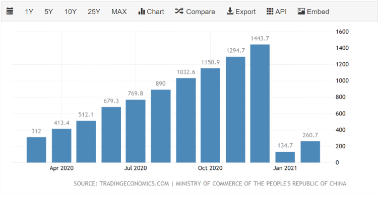
China Foreign Direct Investment March 2020 – February 2021
Another, more theoretical threat is the establishment of Special Drawing Rights (SDR) which is an international type of monetary reserve currency created by the International Monetary Fund (IMF). An SDR is essentially an artificial currency instrument used by the IMF and is built from a basket of important national currencies. The IMF uses SDRs for internal accounting purposes. SDRs are allocated by the IMF to its member countries and are backed by the full faith and credit of the member countries’ governments. The makeup of the SDR is re-evaluated every five years.1
The SDR was formed with a vision of becoming a major element of international reserves, with gold and reserve currencies forming a minor incremental component of such reserves. While this vision has never been realized, there are some economists who warn that the IMF has never lost sight of that vision and is ready to offer it as the new global reserve currency should the opportunity present itself.
At this point, we will keep our eyes on China as they are certainly lobbying to be the leading economic superpower in the 21st century and making their currency the new international reserve.
When does the world lose confidence in our economy and we see a run on the dollar? We do not know the answer. But we think that by staying vigilant and preparing for it now, we can put ourselves in the best position to weather the storm. When it happens, it will likely happen fast, and there won’t be much time to get out of the way.
So, with an environment of higher taxes, lower wages, more regulation and the specter of higher inflation returning, what does that mean for our investment strategies?
The Market
First, some good news. Even in the depths of the great depression, stock markets performed better than many people would believe. Below is a chart of the Dow Jones Industrial Average under FDR.
In fact, it is said that Keynes made a lot of money investing in stocks during this period. According to an article in Morningstar :
“He got rich from buying low and holding on during the 1920s through the early 1940s.”
Keep in mind that this was before the massive monetary interventions that we are experiencing today.
Additionally, analyst Marc Lichtenfeld, author of “Get Rich with Dividends” pointed out recently that:
“…owning the S&P 500 has been more than a hedge against inflation – it has created wealth.”
To his point, here is a 100-year chart of the Dow Jones Industrial Average adjusted for inflation:
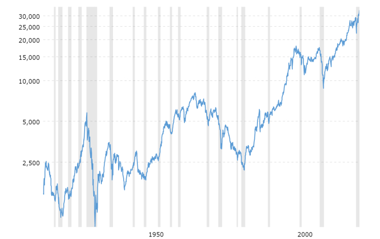
Dow Jones – DJIA – 100 Year Historical Chart
The grey columns represent recessions. As you can see, the larger and boring industrials have increased investors wealth even after we account for inflation. However, it also points out why we prioritize distribution income over price returns. You would not want to be forced to sell your investments to pay your bills at the beginning of those downtrends. Instead, downtrends should be celebrated during pre-retirement as opportunities to buy great companies at a discount price and once in retirement should not be something that keeps you awake at night as long as the business fundamentals of your holdings remain intact.
Therefore, when looking at our investment strategies, we are reminded of a topically appropriate quote:
“When you’re fighting off the alligators, it’s important to remember that the mission was to drain the swamp.”
Despite all the distractions, including emails claiming to make a fortune on “just three stocks” (guess who’s really making the fortune there…), we need to remember the specific purpose we assign to each portion of our investment pool and stay the course with appropriate assets.
Overall, our goal is for our investments to provide cash flow to replace our paychecks when we no longer wish to collect one. As part of this, preserving our purchasing power over the long term is a priority.
While future inflation is a risk, we are still in a 10-year trend of deflation and, as we stated above, we do not know when that trend will reverse.
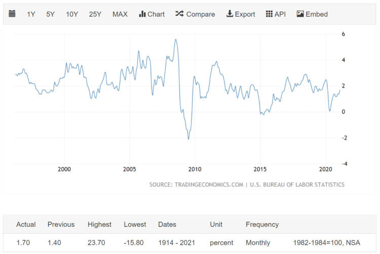
United States Inflation Rate 25 Year Chart ending February 2021
We know that slow growth is deflationary so while we may see some temporary spikes in inflation, we must ride the trend until is clearly reverses. The point is that now is not the time to “dump stocks and buy gold.”
Nor is it time to panic on rising interest rates. As we noted near the beginning of this letter, interest rates are only now approaching the pre-pandemic levels of 2019. We are a long way from the 1980’s.
We also still have trillions of freshly printed dollars moving around the economy looking for a place to go. This means that our “There Is No Alternative” (TINA) theme is still in play and should at least keep the major indices propped up even with periodic bouts of volatility that we should be all used to by now.
If we then apply solid fundamental analysis and include a portion of our allocation to other cash-flow generating assets that will perform well in both low growth and inflationary conditions, as well reasonable allocations to promising growth opportunities and even appropriate fixed income strategies, we should be putting ourselves in a position to achieve our long-term goals despite the short-term spikes in price volatility.
As the environment shifts, we too will shift. While we will continue to seek long term growth in distribution income, the components providing that growth will change over time as some businesses fade and others rise to take their place. We will also take advantage of growth opportunities as they present themselves while trying to avoid chasing returns that may be fleeting.